How to create a responsive mosaic gallery with CSS without Javascript
Oi eu sou o Felipe! Sou artista digital. Nesse blog falo sobre o que gosto e o que me inspira. Compartilho curiosidades sobre o mundo geek, tutoriais e muito mais.
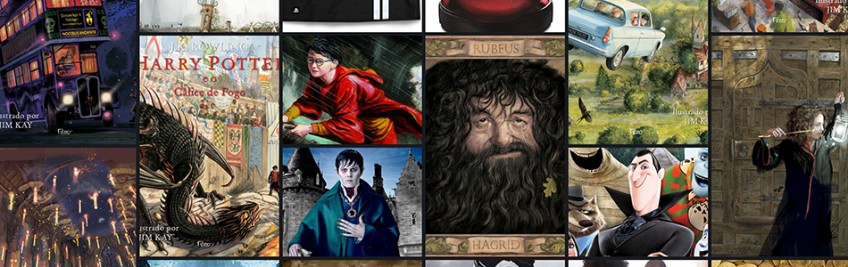
In this tutorial I will teach you how to create an asymmetric mosaic photo gallery using only CSS without javascript and still being responsive. Yes! it is possible and it is simpler than you think.
It is very common to find several mosaic solutions using Javascript and ready-made libraries, Masonry is one of the most used. But in CSS it is possible to do a lot of things in a lighter and more creative way to achieve very similar or even better results. By using pure CSS we end up loading less code and having a lighter and faster website. So let's go?
See the code result in JSFiddle
Study and develop your HTML and CSS
Create a basic HTML page
Use your editor to create a simple page where we will build our mosaic image gallery in it.
<!DOCTYPE html>

<html>

    <head>

        <meta charset="utf-8">

        <meta name="author" content="Boomo - Felipe Moreira">

        <meta name="description" content="Tutorial Mosaico. Boomo - por Felipe Moreira">

        <link rel="shortcut icon" href="favicon.ico">

        <title>Tutorial Mosaico. Boomo - por Felipe Moreira</title>

    </head>

<body>


    </body>

</html>
Add the DIV that will be our image container
In the code below we created a <div> with the id grid and inside it we put several <img> images with just the src for the image, notice that in some images there is span-2 class that we will talk about later in this tutorial. Add this code inside the on the page body created in the previous step.
<div id="grid">

        <img src="https://boomo.com.br/images/noticias/operacao-big-hero-png-c799.png">

        <img src="https://boomo.com.br/images/noticias/peanuts-png-c977.png">

        <img class="span-2" src="https://boomo.com.br/images/noticias/naruto-funko-pop-jpg-c163.jpg">

        <img src="https://boomo.com.br/images/noticias/angry-birds-png-c939.png">

        <img src="https://boomo.com.br/images/noticias/como-treinar-o-seu-dragao-png-c348.png">

        <img src="https://boomo.com.br/images/noticias/detona-ralph-png-c286.png">

        <img src="https://boomo.com.br/images/noticias/divertidamente-png-c684.png">

        <img class="span-2" src="https://boomo.com.br/images/noticias/naruto-funko-pop-2-jpg-c571.jpg">

        <img src="https://boomo.com.br/images/noticias/familia-futuro-png-c618.png">

        <img class="span-2" src="https://boomo.com.br/images/noticias/seto-kaiba-yu-gi-oh-funko-pop-boneco-jpg-c119.jpg">

        <img src="https://boomo.com.br/images/noticias/frozen-png-c476.png">

        <img src="https://boomo.com.br/images/noticias/meu-malvado-favorito-png-c518.png">

        <img src="https://boomo.com.br/images/noticias/the-order-2-temporada-10-png-c992.png">

        <img class="span-2" src="https://boomo.com.br/images/noticias/naruto-rasengan-funko-pop-jpg-c879.jpg">

        <img src="https://boomo.com.br/images/noticias/the-order-2-temporada-8-png-c764.png">

        <img src="https://boomo.com.br/images/noticias/the-order-2-temporada-9-png-c437.png">

        <img src="https://boomo.com.br/images/noticias/the-order-2-temporada-1-png-c901.png">

        <img class="span-2" src="https://boomo.com.br/images/noticias/joey-wheeler-yu-gi-oh-funko-pop-boneco-jpg-c328.jpg">

        <img src="https://boomo.com.br/images/noticias/the-order-2-temporada-2-png-c539.png">

        <img class="span-2" src="https://boomo.com.br/images/noticias/dragao-branco-de-olhos-azuis-yu-gi-oh-funko-pop-boneco-jpg-c914.jpg">

        <img src="https://boomo.com.br/images/noticias/the-order-2-temporada-3-png-c209.png">

        <img src="https://boomo.com.br/images/noticias/the-order-2-temporada-4-png-c457.png">

        <img class="span-2" src="https://boomo.com.br/images/noticias/naruto-sexy-no-jutsu-funko-pop-jpg-c248.jpg">

        <img src="https://boomo.com.br/images/noticias/the-order-2-temporada-5-png-c577.png">

        <img class="span-2" src="https://boomo.com.br/images/noticias/pegasus-yu-gi-oh-funko-pop-boneco-jpg-c256.jpg">

        <img src="https://boomo.com.br/images/noticias/the-order-2-temporada-6-png-c801.png">

        <img src="https://boomo.com.br/images/noticias/the-order-2-temporada-7-png-c637.png">

        <img class="span-2" src="https://boomo.com.br/images/noticias/exodia-yu-gi-oh-funko-pop-boneco-jpg-c686.jpg">

        <img src="https://boomo.com.br/images/noticias/mago-negro-yu-gi-oh-funko-pop-boneco-jpg-c600.jpg">

    </div>
Full HTML code
<!DOCTYPE html>

<html>

    <head>

        <meta charset="utf-8">

        <meta name="author" content="Boomo - Felipe Moreira">

        <meta name="description" content="Tutorial Mosaico. Boomo - por Felipe Moreira">

        <link rel="shortcut icon" href="favicon.ico">

        <title>Tutorial Mosaico. Boomo - por Felipe Moreira</title>

    </head>

<body>

       <div id="grid">

        <img src="https://boomo.com.br/images/noticias/operacao-big-hero-png-c799.png">

        <img src="https://boomo.com.br/images/noticias/peanuts-png-c977.png">

        <img class="span-2" src="https://boomo.com.br/images/noticias/naruto-funko-pop-jpg-c163.jpg">

        <img src="https://boomo.com.br/images/noticias/angry-birds-png-c939.png">

        <img src="https://boomo.com.br/images/noticias/como-treinar-o-seu-dragao-png-c348.png">

        <img src="https://boomo.com.br/images/noticias/detona-ralph-png-c286.png">

        <img src="https://boomo.com.br/images/noticias/divertidamente-png-c684.png">

        <img class="span-2" src="https://boomo.com.br/images/noticias/naruto-funko-pop-2-jpg-c571.jpg">

        <img src="https://boomo.com.br/images/noticias/familia-futuro-png-c618.png">

        <img class="span-2" src="https://boomo.com.br/images/noticias/seto-kaiba-yu-gi-oh-funko-pop-boneco-jpg-c119.jpg">

        <img src="https://boomo.com.br/images/noticias/frozen-png-c476.png">

        <img src="https://boomo.com.br/images/noticias/meu-malvado-favorito-png-c518.png">

        <img src="https://boomo.com.br/images/noticias/the-order-2-temporada-10-png-c992.png">

        <img class="span-2" src="https://boomo.com.br/images/noticias/naruto-rasengan-funko-pop-jpg-c879.jpg">

        <img src="https://boomo.com.br/images/noticias/the-order-2-temporada-8-png-c764.png">

        <img src="https://boomo.com.br/images/noticias/the-order-2-temporada-9-png-c437.png">

        <img src="https://boomo.com.br/images/noticias/the-order-2-temporada-1-png-c901.png">

        <img class="span-2" src="https://boomo.com.br/images/noticias/joey-wheeler-yu-gi-oh-funko-pop-boneco-jpg-c328.jpg">

        <img src="https://boomo.com.br/images/noticias/the-order-2-temporada-2-png-c539.png">

        <img class="span-2" src="https://boomo.com.br/images/noticias/dragao-branco-de-olhos-azuis-yu-gi-oh-funko-pop-boneco-jpg-c914.jpg">

        <img src="https://boomo.com.br/images/noticias/the-order-2-temporada-3-png-c209.png">

        <img src="https://boomo.com.br/images/noticias/the-order-2-temporada-4-png-c457.png">

        <img class="span-2" src="https://boomo.com.br/images/noticias/naruto-sexy-no-jutsu-funko-pop-jpg-c248.jpg">

        <img src="https://boomo.com.br/images/noticias/the-order-2-temporada-5-png-c577.png">

        <img class="span-2" src="https://boomo.com.br/images/noticias/pegasus-yu-gi-oh-funko-pop-boneco-jpg-c256.jpg">

        <img src="https://boomo.com.br/images/noticias/the-order-2-temporada-6-png-c801.png">

        <img src="https://boomo.com.br/images/noticias/the-order-2-temporada-7-png-c637.png">

        <img class="span-2" src="https://boomo.com.br/images/noticias/exodia-yu-gi-oh-funko-pop-boneco-jpg-c686.jpg">

        <img src="https://boomo.com.br/images/noticias/mago-negro-yu-gi-oh-funko-pop-boneco-jpg-c600.jpg">

    </div>

    </body>

</html>
Bringing mosaic to life with CSS
Now, let's start creating the file in CSS. You can do it the way you prefer by adding a separate file in the head or creating the <style> tag within the same file. Here we will use the <style> tag to simplify it.
We started by adding a small code just to remove the margins and change the background color of the document. This does not affect our mosaic at all.
html,body{

  margin: 0;

  padding: 0;

  background: #000

}
Main Container CSS
In our div, that is the container of our images, there is the id grid and we will use it in css to define the styles of the container. We will use the grid layout to make our mosaic.
#grid {

    display: grid;

    grid-template-columns: repeat(auto-fill, minmax(300px, 1fr));

    grid-auto-rows: minmax(250px, auto);

    grid-auto-flow: dense;

    grid-column-gap: .5em;

    grid-row-gap: .5em;

    margin: 20px 0 0 0;

}
Then we defined the display as a grid and added some styles that will define the behavior of the images inside the container.
grid-template-columns: repeat(auto-fill, minmax(300px, 1fr));
This style defines the size of the images in line / horizontal function. repeat repeats the size for x number of images, auto-fill determines that size automatically and minmax is a function that calculates the size respecting the 300px and ignoring it if the images are larger.
grid-auto-rows: minmax(250px, auto);
This line does the same as the previous one but in columns / vertical.
grid-auto-flow: dense;
This line controls an automatic positioning algorithm and the dense property always tries to fill the 'holes'.
grid-column-gap: .5em;

grid-row-gap: .5em;
These styles define the spacing between images in rows and columns.
Defining the style of the images inside the container
Here it is simpler. We are applying a style to the images inside the grid. We are only setting the size and height to 100% and the object-fit makes the image fill all spaces always regardless of its size.
#grid img {

    width: 100%;

    height: 100%;

    object-fit: cover;

}
To end our tutorial, we create a class called span-2. These styles define what is the final space the image can reach. I know it's a little confusing but you should understand the span value as parts! Below you can see that the span in the column is 1, therefore, it occupies part of the horizontal and 2 in the vertical. In other words, all images that posesses this class will occupy larger spaces vertically creating the mosaic.
.span-2 {

    grid-column-end: span 1;

    grid-row-end: span 2;

}
When to use the span-2 class?
This is where you need to be creative. In my example, I manually defined the span-2 class in each image but you can make a code either in PHP or Javascript that calculates the size of the images and if the image height is greater than the width, you must define the span-2 class. By doing so all images that are taller take up more space in the mosaic.
Complete Code
<!DOCTYPE html>

<html>

    <head>

        <meta charset="utf-8">

        <meta name="author" content="Boomo - Felipe Moreira">

        <meta name="description" content="Tutorial Mosaico. Boomo - por Felipe Moreira">

        <link rel="shortcut icon" href="favicon.ico">

        <title>Tutorial Mosaico. Boomo - por Felipe Moreira</title>

        <style>

        html,body{

          margin: 0;

          padding: 0;

          background: #000

        }

        #grid {

            display: grid;

            grid-template-columns: repeat(auto-fill, minmax(300px, 1fr));

            grid-auto-rows: minmax(250px, auto);

            grid-auto-flow: dense;

            grid-column-gap: .5em;

            grid-row-gap: .5em;

            margin: 20px 0 0 0;

        }

        #grid img {

            width: 100%;

            height: 100%;

            object-fit: cover;

        }

        .span-2 {

            grid-column-end: span 1;

            grid-row-end: span 2;

        }

        </style>

    </head>

    <body>

       <div id="grid">

        <img src="https://boomo.com.br/images/noticias/operacao-big-hero-png-c799.png">

        <img src="https://boomo.com.br/images/noticias/peanuts-png-c977.png">

        <img class="span-2" src="https://boomo.com.br/images/noticias/naruto-funko-pop-jpg-c163.jpg">

        <img src="https://boomo.com.br/images/noticias/angry-birds-png-c939.png">

        <img src="https://boomo.com.br/images/noticias/como-treinar-o-seu-dragao-png-c348.png">

        <img src="https://boomo.com.br/images/noticias/detona-ralph-png-c286.png">

        <img src="https://boomo.com.br/images/noticias/divertidamente-png-c684.png">

        <img class="span-2" src="https://boomo.com.br/images/noticias/naruto-funko-pop-2-jpg-c571.jpg">

        <img src="https://boomo.com.br/images/noticias/familia-futuro-png-c618.png">

        <img class="span-2" src="https://boomo.com.br/images/noticias/seto-kaiba-yu-gi-oh-funko-pop-boneco-jpg-c119.jpg">

        <img src="https://boomo.com.br/images/noticias/frozen-png-c476.png">

        <img src="https://boomo.com.br/images/noticias/meu-malvado-favorito-png-c518.png">

        <img src="https://boomo.com.br/images/noticias/the-order-2-temporada-10-png-c992.png">

        <img class="span-2" src="https://boomo.com.br/images/noticias/naruto-rasengan-funko-pop-jpg-c879.jpg">

        <img src="https://boomo.com.br/images/noticias/the-order-2-temporada-8-png-c764.png">

        <img src="https://boomo.com.br/images/noticias/the-order-2-temporada-9-png-c437.png">

        <img src="https://boomo.com.br/images/noticias/the-order-2-temporada-1-png-c901.png">

        <img class="span-2" src="https://boomo.com.br/images/noticias/joey-wheeler-yu-gi-oh-funko-pop-boneco-jpg-c328.jpg">

        <img src="https://boomo.com.br/images/noticias/the-order-2-temporada-2-png-c539.png">

        <img class="span-2" src="https://boomo.com.br/images/noticias/dragao-branco-de-olhos-azuis-yu-gi-oh-funko-pop-boneco-jpg-c914.jpg">

        <img src="https://boomo.com.br/images/noticias/the-order-2-temporada-3-png-c209.png">

        <img src="https://boomo.com.br/images/noticias/the-order-2-temporada-4-png-c457.png">

        <img class="span-2" src="https://boomo.com.br/images/noticias/naruto-sexy-no-jutsu-funko-pop-jpg-c248.jpg">

        <img src="https://boomo.com.br/images/noticias/the-order-2-temporada-5-png-c577.png">

        <img class="span-2" src="https://boomo.com.br/images/noticias/pegasus-yu-gi-oh-funko-pop-boneco-jpg-c256.jpg">

        <img src="https://boomo.com.br/images/noticias/the-order-2-temporada-6-png-c801.png">

        <img src="https://boomo.com.br/images/noticias/the-order-2-temporada-7-png-c637.png">

        <img class="span-2" src="https://boomo.com.br/images/noticias/exodia-yu-gi-oh-funko-pop-boneco-jpg-c686.jpg">

        <img src="https://boomo.com.br/images/noticias/mago-negro-yu-gi-oh-funko-pop-boneco-jpg-c600.jpg">

    </div>

    </body>

</html>
Study and develop your HTML and CSS